School Campus Model Scale: Keeping Classrooms and Routes Readable
A school board can only approve what it can read, and a campus model with unreadable classrooms wins no confidence. Choose a scale that keeps rooms, play areas and walkways legible while the model still fits through the boardroom door. Talk to a maker who has built campus models before you commit.
See everything Moriasi3D Models can do for you.
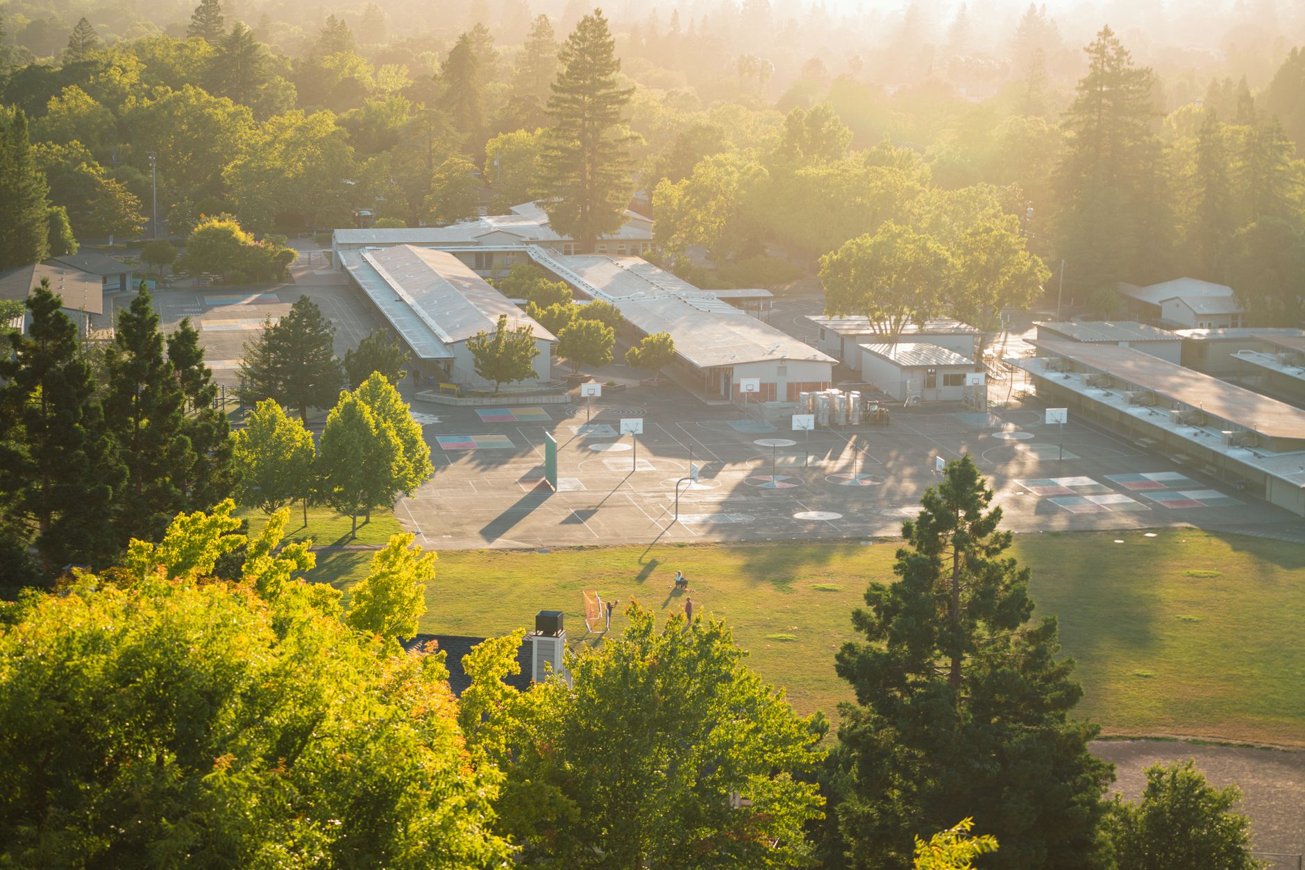
Planning a new school or expanding an existing one means asking a board of governors, a parent body and a county planning office to understand dozens of decisions at once. A physical model is often the fastest way to help them do that, but only if the school campus model scale is chosen with care. Pick a scale that is too small and the classrooms turn into grey blocks that nobody can read. Pick one that is too large and the model will not fit through the boardroom door. Good scale model designs sit between those extremes, and finding that balance for a campus is a different exercise from scaling a single house. This article walks through how to choose it so that classrooms, play areas and circulation routes stay clear to everyone who looks at the model.
Why a Campus Model Is Harder to Scale Than a Single Building
A campus spreads many buildings across a large site, so the scale must fit the whole footprint on one table. A typical day school in Nairobi might include a classroom block, an administration wing, a dining hall, a library, a sports field and a parking area. A boarding school adds dormitories, staff housing and a chapel or assembly hall. All of this needs to appear on the same base without the model becoming something that cannot be moved, stored or displayed. That constraint forces a smaller scale than you would choose for a house, and a smaller scale makes every detail harder to read.
The difficulty is that the small features are exactly what a school board cares about. Classroom windows, corridor widths, covered walkways and play equipment all influence how the school feels and how safe it is. If the scale is too small, a 1.2 meter window shrinks to a few millimeters, and a corridor becomes a pencil line. The test I suggest is simple: stand a meter from the model and check whether the features that matter are still distinguishable. If they are not, the scale needs to change or the model needs to be split into zones.
Board members and parents often judge the plan from the model alone, so legibility matters as much as accuracy. Many of them are not trained to read drawings, and they will form their opinion in the first minute of looking. A model that is dimensionally perfect but visually muddy will draw questions that the plan has already answered. A model that is clear, even if it simplifies a few details, will move the meeting forward. Treat legibility as a design requirement from the start, not as something that gets solved at the end.
Matching the School Campus Model Scale to the Size of the Site
Start by estimating the campus footprint in meters and checking how it fits on a practical display surface. Take the longest dimension of the site and the shortest, then divide each by the candidate scale to see the size of the finished base. A campus of 200 by 150 meters comes out at 1000 by 750 millimeters at 1:200, which fits on a standard boardroom table with room to walk around. The same campus at 1:500 measures only 400 by 300 millimeters, which is easy to carry but leaves very little room for detail. It also helps to measure the actual table or stand where the model will be shown, because the display surface is the real limit.
Compare the common architectural scales for whole-site plans, which are usually 1:200, 1:250 and 1:500. At 1:200, a classroom of 8 by 7 meters becomes about 40 by 35 millimeters, large enough to show a roof form, door positions and a few window openings. At 1:250 the same classroom measures 32 by 28 millimeters, which is still readable but starts to push the limits of fine detail. At 1:500 it shrinks to about 16 by 14 millimeters, which is fine for massing and placement but too small for any interior thinking. For most school campuses of moderate size, 1:200 or 1:250 is the sweet spot, and 1:500 is reserved for very large sites.
Reserve larger scales for the core teaching block when the board needs to review interior layouts. If the discussion will turn on how classrooms connect to a central corridor, a separate model of that block at 1:100 gives each classroom around 80 by 70 millimeters of room. Some clients prefer a removable roof so that the layout can be seen from above while the exterior stays accurate. This two-model approach lets the wider campus model stay manageable while the detailed block carries the conversation about interiors. It also keeps the budget under control, since only the area that needs fine detail is built at the larger scale.
Keeping Classrooms and Play Areas Legible
A classroom wing needs enough room on the model for walls, doors and window openings to remain distinct. At the scales used for whole campuses, the wall thickness might be only a millimeter or two, so the way the wing is built matters more than the number of details. Clean edges, consistent heights and clearly cut openings give the eye something to hold on to. Repeating windows in a regular rhythm helps a viewer count classrooms at a glance. When these basics are right, the building reads as a school before anyone explains it.
Play fields and courts should be shown with clear boundaries so their size reads correctly. A football pitch of 100 by 60 meters becomes 500 by 300 millimeters at 1:200, which is a large and visible part of the model, and its proportion against the buildings tells the board how generous the site is. Netball and basketball courts, running tracks and playgrounds benefit from a slightly different surface tone and a crisp edge line. Trees around the field should be modest in size so that they frame the space instead of hiding it. When the boundaries are clear, parents can see at once whether children will have enough room to play.
Avoid over-detailing tiny elements that will be lost at the chosen scale. Individual desks, swings or bicycle racks might seem like a nice touch, but at 1:200 they become specks that add clutter without adding information. It is better to represent a playground as a defined zone with a simple textured surface, and a bicycle shelter as a small roofed block. Removing detail that nobody can see lets the larger shapes breathe, and it keeps the cost sensible. The discipline of leaving things out is often what separates a clear campus model from a busy one.
Showing Circulation Routes Clearly
Walkways, drop-off zones and service roads must be visible enough for planners to judge safety and flow. Circulation is one of the first things a county planner or a concerned parent will study, because it shows where children walk, where vehicles arrive and where the two might meet. A 2 meter pedestrian path becomes 10 millimeters wide at 1:200 but only 4 millimeters at 1:500, so the scale directly affects whether paths remain a feature or disappear. Drop-off bays should be shown with their real depth so that queuing space can be judged. If the model cannot show these routes clearly, it is probably at the wrong scale for the questions being asked.
Use contrasting finishes or colour to separate pedestrian paths from vehicle access. A lighter, smoother surface for pedestrian routes next to a darker, slightly coarser surface for roads makes the separation obvious even from across the table. Covered walkways can be shown with a thin roof plane so that viewers can see how pupils stay sheltered between blocks. Service roads for kitchen deliveries or waste collection deserve their own tone, since they are the routes most likely to conflict with children. The colours do not need to be bright, only different enough to be read quickly.
Check that gates, fences and crossings are represented at a size the audience can follow. Main gates, pedestrian gates and the security point are central to how a school manages entry, so they should be visible as distinct elements rather than gaps in a boundary line. Perimeter walls can be built in thin material, and fence lines can be suggested with a fine, consistent edge. Zebra crossings and speed bumps matter for safety discussions, so a simple painted marking at the right location is worth including. A reviewer should be able to trace a child's journey from the gate to the classroom without losing the path.
Presenting the Campus Model to School Boards and Architects
Plan the display so reviewers can walk around the model and see each zone from a comfortable height. A table that sits at around 800 to 900 millimeters lets seated and standing viewers look across the site without bending uncomfortably. Leave at least a meter of clear floor on every side so that people can move around while others are talking. Good lighting that does not cast heavy shadows helps small features stay visible, and a neutral background keeps attention on the model. These practical details are easy to forget until the day of the meeting, when it is too late to change them.
Label phases of construction and existing buildings separately so the master plan is easy to understand. Many school projects are built in stages, and the board needs to see what exists today, what will be built first and what will follow. Existing buildings can be shown in a neutral tone, while each new phase is given its own distinct finish or removable pieces. Removable blocks are especially helpful, because they let the presenter show the campus as it stands and then add each phase in turn. This turns the model into a way of telling the story of the project, not just displaying its final form.
Bring a plan drawing alongside the model so the scale relationship is clear to everyone in the room. Architects will want to check the model against the drawing, and board members will find it easier to follow when the two are side by side. A printed scale bar on the base, or a labeled grid, helps everyone judge distances in real terms. It is worth stating the scale aloud at the start so that nobody mistakes the field for a smaller or larger space than it is. When the drawing and the model agree visibly, trust in the whole proposal tends to rise.
Working With Moriasi3D Models on Your Campus Project
Share your site survey, building drawings and target presentation date at the start of the project. These three items tell us how big the site is, how detailed the buildings need to be and how much time we have to build. If the drawings are still evolving, tell us which parts are fixed and which may change, so that we can plan the construction in a way that allows adjustments. Early information also lets us confirm that the model will fit through the doors and tables of the venue where it will be shown. The more we know on day one, the fewer surprises appear near the deadline.
Discuss which scale and level of detail suits your board, planners and budget before construction of the model begins. We will usually suggest two or three options, such as a single 1:250 campus model, or a 1:200 campus with a separate 1:100 block for the classrooms. Each option is shown with its likely size, level of detail and cost, so you can choose on the basis of what your audience needs to see. This conversation is where most of the value is created, because the right scale decision prevents rework later. It also means the board gets a model that answers its actual questions.
Our team in Nairobi has delivered many completed models across East Africa and can advise on the right approach for your campus. We work from our base off Ngong' Road, and we have built models for sites of very different sizes and conditions. That experience helps us anticipate problems such as a long, narrow plot, a steep slope or a crowded urban boundary. We are happy to review your drawings and talk through the options before you commit to anything. If a school campus is on your agenda, a short conversation with us is a practical first step.
Choosing the right school campus model scale comes down to a few clear decisions made in the right order. Measure the site, test how it fits on a real display surface, and compare 1:200, 1:250 and 1:500 against the features your audience must read. Keep classrooms and play areas crisp by leaving out details that will vanish at that scale, and make circulation routes obvious through contrast and careful sizing of gates and crossings. Present the model at a comfortable height, separate existing and future phases, and bring the plan drawing along so that everyone understands the scale. When these choices are made with care, a board or a planning committee can look at the model and understand the master plan within minutes. If you are preparing a campus presentation and want a model that people can read at a glance, we would be glad to help you choose the scale and build it.
See everything Moriasi3D Models can do for you.
Visit Moriasi3D Models →